
KB User's Guide - Advanced HTML - Creating Collapsing and Expanding Panels
Adding a Panel with the KB Editor
Using the TinyMCE editor in the KB, you can easily add collapsible panels to your document without needing to edit the document's HTML code. This button can be found on the right end of the toolbar and under the Insert menu. The icon looks like a plus and minus sign: 
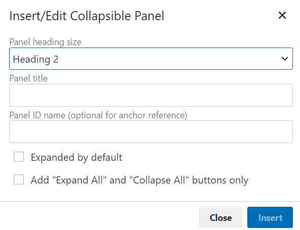
After clicking this button, you will be prompted to choose the appropriate heading size for the panel, as well as enter the panel heading text and an optional ID for anchor reference. You will also be able to choose if you would like the panel to be expanded by default. Alternatively, you can use the Add "Expand All" and "Collapse All" buttons only option to add buttons that allow the reader to open or close all panels within a document.
Example
Below is an example of a set of panels that can be used to organize content within a KB document. They are designed with accessibility in mind, so users may navigate to each panel with a keyboard, and ARIA labels will announce their current state.
General Functionality
By default, panels will be collapsed when the page loads, unless certain panels were set to be expanded by default. This can be seen with the first panel in the example.
If the heading for a panel is given an document ID, you may also link to the panel directly using an anchor link. If a user follows an anchor link to a panel from another page, the page containing the panels will open directly to the panel in question. Additionally, that panel will be automatically expanded, and the other panels will be collapsed, regardless of their typical default settings. If an anchor link is followed from the same page as the panels, the page will jump directly to that panel, which will also be expanded (note that this does not affect the state of the other panels).
Please see the example below:
Please see the instructions for information on how to become authorized for our very important service, as well as instructions for installation and getting support. You may use the links above to jump directly to a section.
How to Obtain Authorization
Background:
This service requires that you submit an authorization form in order to get access.
Procedure
-
Obtain the necessary form. This form is available at https://www.google.com.
-
Turn in the form to your supervisor. Your supervisor will enter your permissions into the correct system.
-
Wait for a confirmation email. Use the link in the confirmation email you receive to access the system.
How to Install
Background:
This service has a simple, three-step installation procedure.
Procedure
-
Get the installation file from your departmental IT group. If your departmental IT does not have the file available, please contact the DoIT Tech store.
-
Launch the installation file from your computer. A window will appear prompting you for more information.
-
Click 'Install' and wait for the install to complete. The process should take around 10 minutes.
How to Get Help
Lorem ipsum dolor sit amet, consectetur adipiscing elit. Nullam condimentum convallis dolor ut aliquam. Sed dignissim in est vel volutpat. Maecenas ac nulla urna. Morbi sed pulvinar mauris, vel dictum augue. Nulla facilisi. In sem nibh, accumsan eget metus a, bibendum mollis dolor. Morbi ac sapien eu turpis condimentum venenatis in vitae dolor. Interdum et malesuada fames ac ante ipsum primis in faucibus. Vestibulum facilisis faucibus diam, nec posuere eros mattis elementum. In hac habitasse platea dictumst. Ut lobortis lorem non porta maximus. Curabitur at viverra nibh. Aliquam ut vulputate nulla. Integer et nibh id lacus maximus pellentesque. In congue, ante et sollicitudin ultricies, nisl metus semper ipsum, vitae vehicula dolor neque id libero. Phasellus a pellentesque nibh.
Adding Panels with HTML
This section is provided as a reference only; we recommend using the built-in editor tool to add panels.
To create a panel in a KB document, please follow the steps below while working in the Source mode window in the editor. The first group of steps is required, and the second set includes optional settings for expanding panels by default and creating anchors for panels.
Required Steps
-
Insert a heading tag and give it the class panel-head. Set the text for the heading to whatever you would like displayed as the visible name of the panel, and set the heading size (h2, h3, etc.) as appropriate for the structure of your document.
<h2 class="panel-head">Section One</h2>
-
Directly below the heading, insert a div tag and give it the class panel-content. Place the desired content inside of this div tag, using any other HTML tags that are needed for formatting.
<h2 class="panel-head">Section One</h2>
<div class="panel-content">
  <p>Some content to be displayed inside panel one. This content will be shown/hidden as the panel is toggled.</p>
</div>
-
Paste the following into the JavaScript/CSS field (located under "Additional Fields"):
<script src="/cssjs/jquery/current/jquery.min.js"></script>
<script type="text/javascript" src="/cssjs/simple-collapsing-panels.js"></script>
<link rel="stylesheet" type="text/css" href="/cssjs/simple-collapsing-panels.css">
Optional Settings
-
To add buttons to expand and collapse all panels at once, paste the following above and/or below your panels:
<button id="expandAll" type="button">Expand All</button>
<button id="collapseAll" type="button">Collapse All</button>
-
If you would like a panel to be expanded by default when the page is loaded, add the class "expanded" to the heading tag, e.g.:
<h2 class="panel-head expanded">Section One</h2>
-
If you would like to anchor to a panel from a link (either on the current page or from a different page), add an ID to the heading tag with the desired anchor text, e.g.:
<h2 class="panel-head" id="section-one">Section One</h2>
You may then reference the heading tag in an anchor link, e.g.:
<a href="#section-one">Section One</a>
Note: If you link directly to a panel from a different page, the linked panel will be expanded and all other panels will be collapsed when the page loads. If you link to a panel from the current page, the linked panel will be expanded (other panels will not be collapsed if already opened).