KB User's Guide - Site Pref Tab - Mobile CSS
Note
You must have full administrative permissions in your space to perform these steps. This means access to the Documents, Settings, and Users tabs.
When is Mobile View Used?
The site URLs are exactly the same for mobile view and full view. Your KB site will load in mobile view when the KB detects that the user is viewing the site on a mobile device. Generally, this is limited to phones, so iPads and other larger tablets will typically load the "full view" version of the site.
If you want to see what your KB site looks like in mobile view, you will need to go to the site on a mobile device, or impersonate a mobile device with your browser. Please see the guides below to find the steps for your browser:
- Chrome - Simulate mobile devices with device mode
- Safari - Setting user agent with the Develop menu
- Firefox - Responsive design mode
- Edge - Emulate mobile devices
In order to get mobile view to load, please note that you may need to reload the page after following the steps for your browser.
Customizing Mobile View for your KB Site
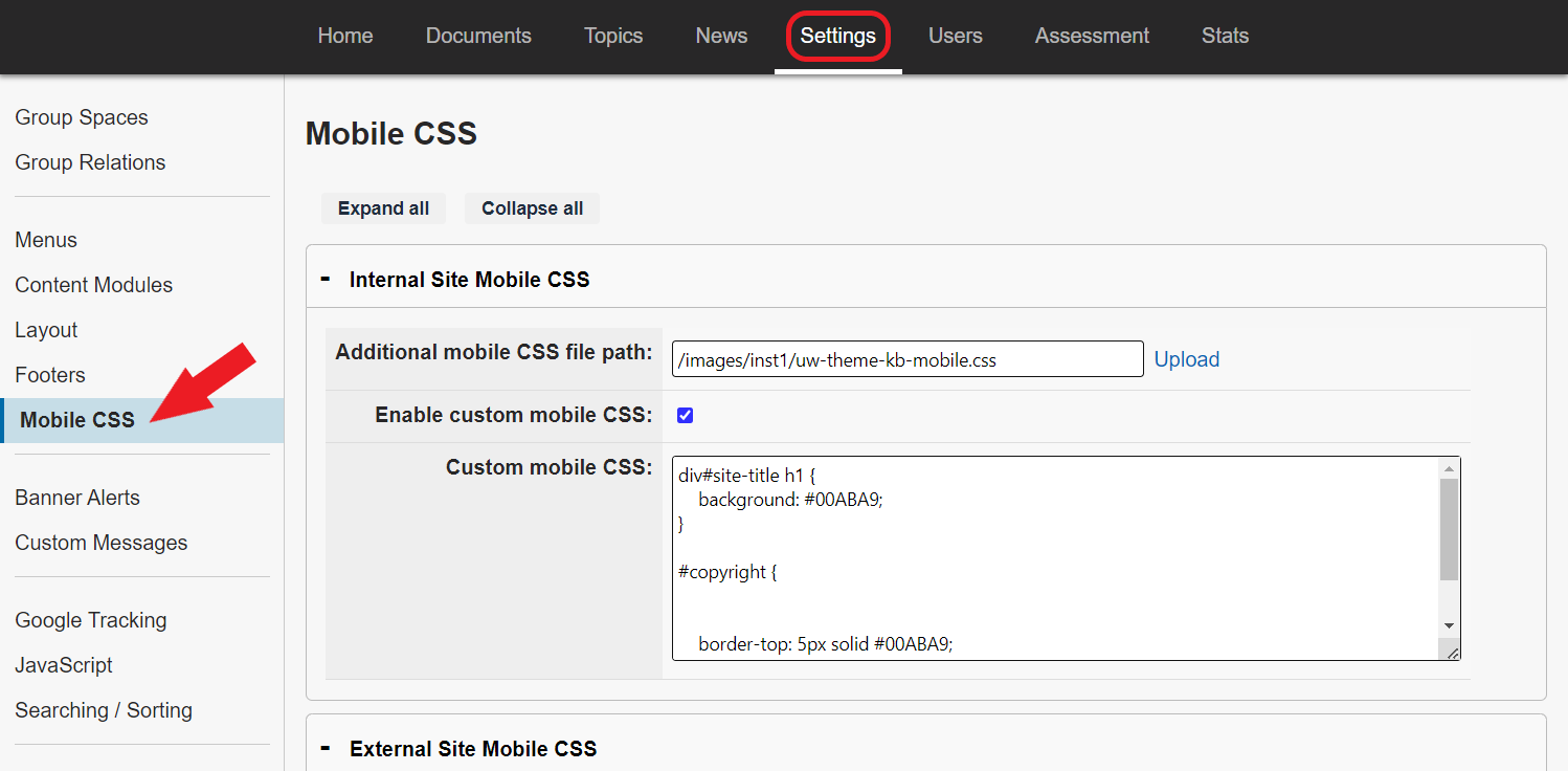
To modify the look and feel of your site's mobile view, open the KB Admin Tools and go to the Settings Tab > Mobile CSS. You will see two separate sections that allow you to customize your internal and external sites separately.
-
Additional mobile CSS file path: If this field is blank, then your site is using the
default_mobile.cssfile that is linked at the bottom of the page. If you would like to replace this default CSS file with your own, you can upload a new CSS file and copy the path to this field. -
Enable custom mobile CSS: Check this box if you have added custom CSS to the field below and would like it to take effect on your site.
-
Custom mobile CSS: Use this field to enter custom CSS that modifies either the default mobile CSS (if using), or the CSS file that you referenced in the "Additional mobile CSS file path" field. This CSS will only be used if the box above is checked.


