
KB User's Guide - Documents Tab - TinyMCE Custom Button Plugin
Custom Button 
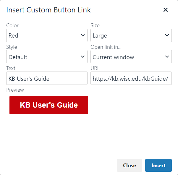
This plugin is found next to the Collapsible Panel button in the toolbar, or under the Insert menu. It allows you to insert links styled as buttons into the body of a KB document. Clicking the Button plugin will open a dialog window with the following options:
- Color - Red or blue (colors match UW–Madison’s Colors for Web style guide)
- Size - Default or large
- Style
- Default: Solid color with white text
- Reversed: Colored outline and text on a white background
- Open link in - Current window or new window/tab
- Text - The text to be displayed on the button
- URL - The link to navigate to when the button is clicked
As options are changed, the window will display a button preview that dynamically updates. Click Insert to add the button to your document.
To edit an existing button, click within button, and edit the text as needed. Additionally, the custom Custom KB buttons icon and the Insert/edit link icon will be highlighted in the editor toolbar. Clicking the plugin icon will allow you to update any options for the existing button. Clicking the link icon will allow you to edit the button's link properties.