KB User's Guide - Advanced HTML - Create a list of featured links
- Overview of the featured links page element
- Update your site to use a standard one column layout for subpages
- Apply a custom homepage to use the featured links page element
- Add featured links to a KB document
- Add features links to your homepage with a custom content module
- Design guidelines
Overview
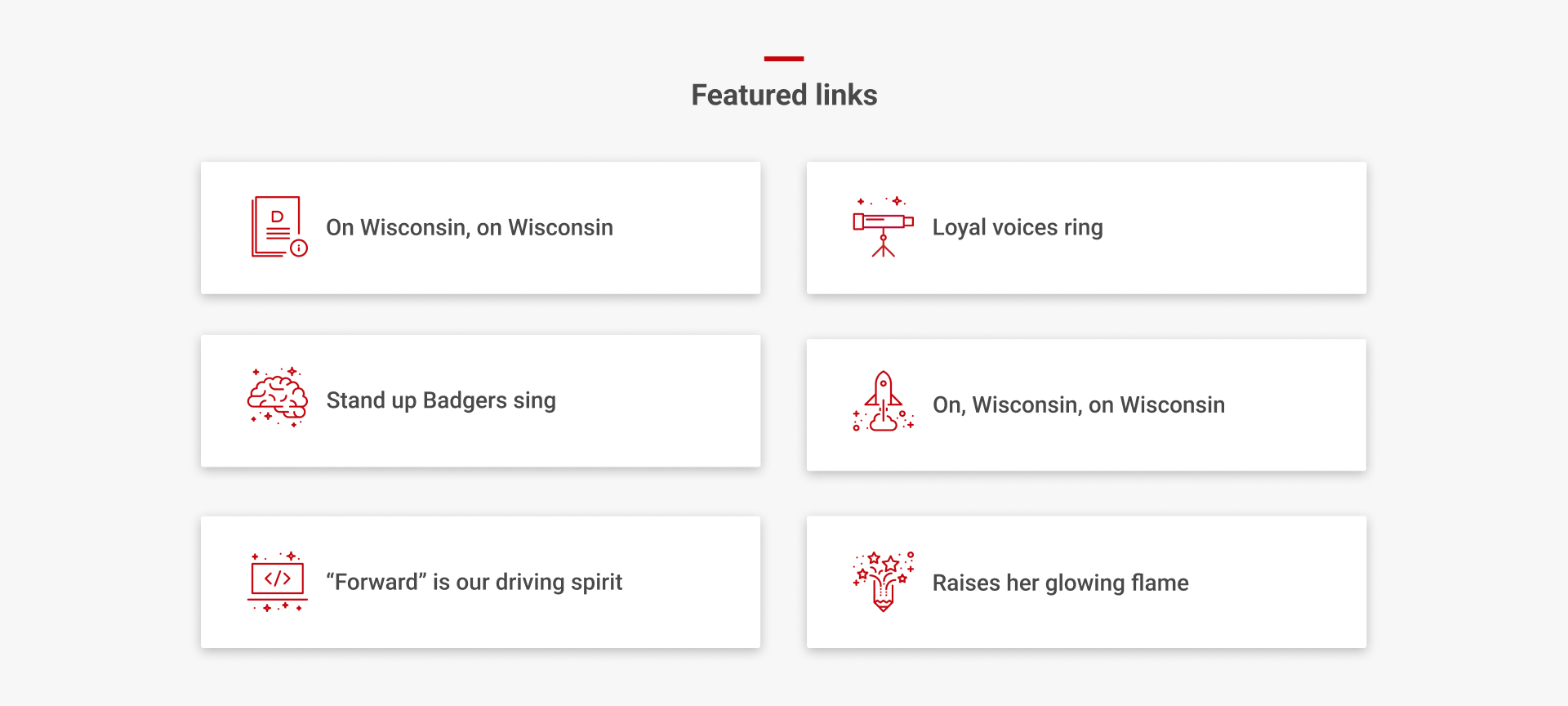
Cards will display in two columns on desktop and one column on mobile devices. There are a few different ways to customize this element.

- Add icons to convey meaning, and change their color
- Learn how to use icons and find resources for icon libraries
- Or don't add icons for a more minimal look
- Display a UW minibar (short red line) above the header of a group of featured links
- Note: This minibar will only display if you use the Homepage Layout V2 as a custom homepage.
Don't do this
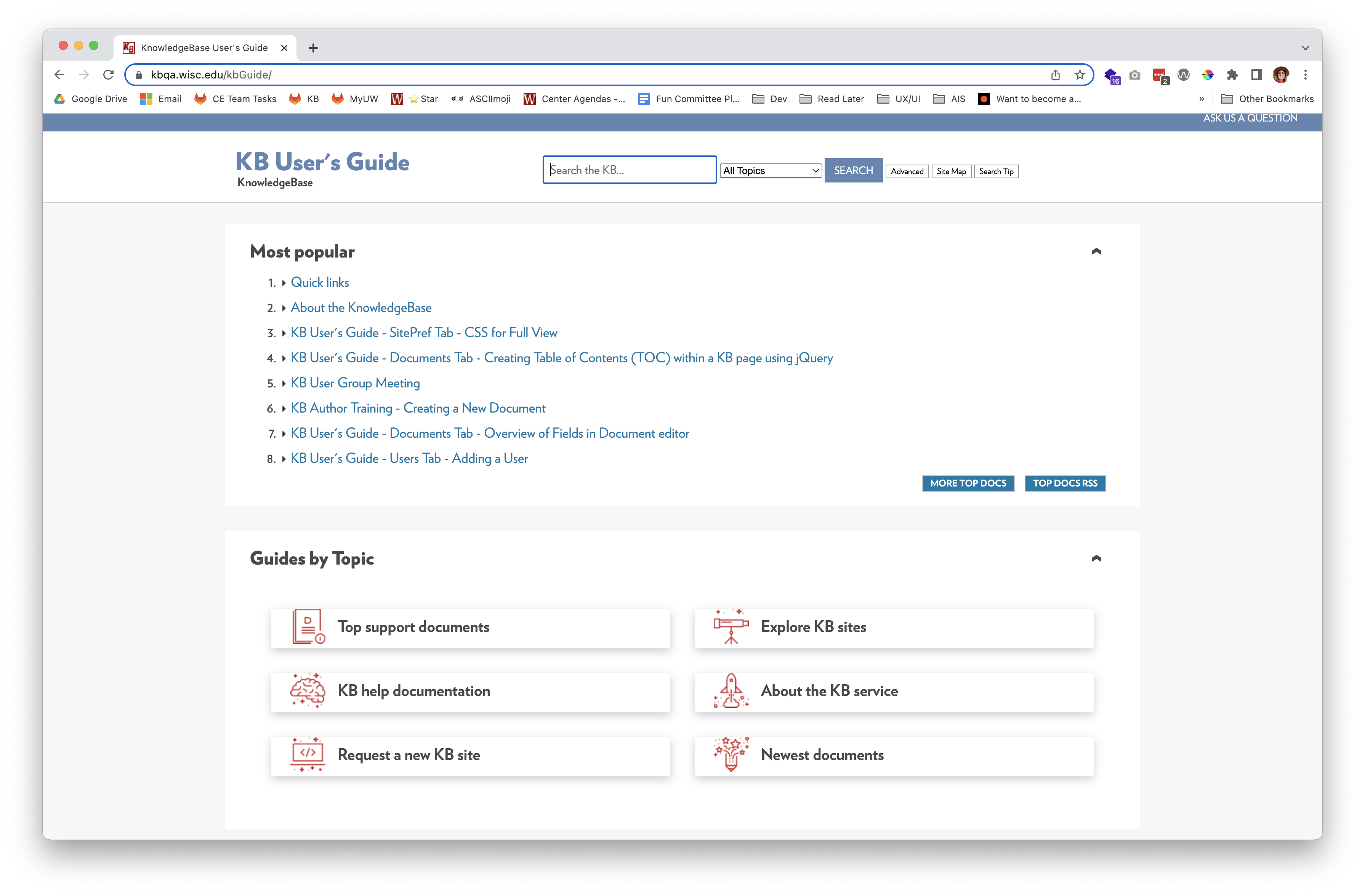
This page element is not intended for KB sites that use a two or three column layout, because they will not display side-by-side as intended:

Do not use this page element if you use the Standard / Subpage Layout settings for your homepage design. The styling will not work.

Do this
Use a one column layout for your site with no left or right side modules applied. You can accomplish by...
- Use the standard layout settings with a 100% width applied for your homepage and subpages
- Do the above, but also use a custom KB template for your homepage rather than the standard settings
Update your site's standard settings to a one column layout...
- Navigate to Settings, and then Site Layouts
- Set your Standard / Subpage Layout to use Relative Width (100% up to 3 columns) as the layout
- Go to Side Modules in the left hand sidebar
- Remove any side modules on the Side Right or Side Left position
- Click Update to save changes
Apply a custom KB layout as your homepage...
- Under the Settings tab and Site Layouts, open the Custom Homepage panel
- Select Homepage Layout V2 as your layout
- Click Update to save changes
- Learn how to design your site using Homepage Layout V2

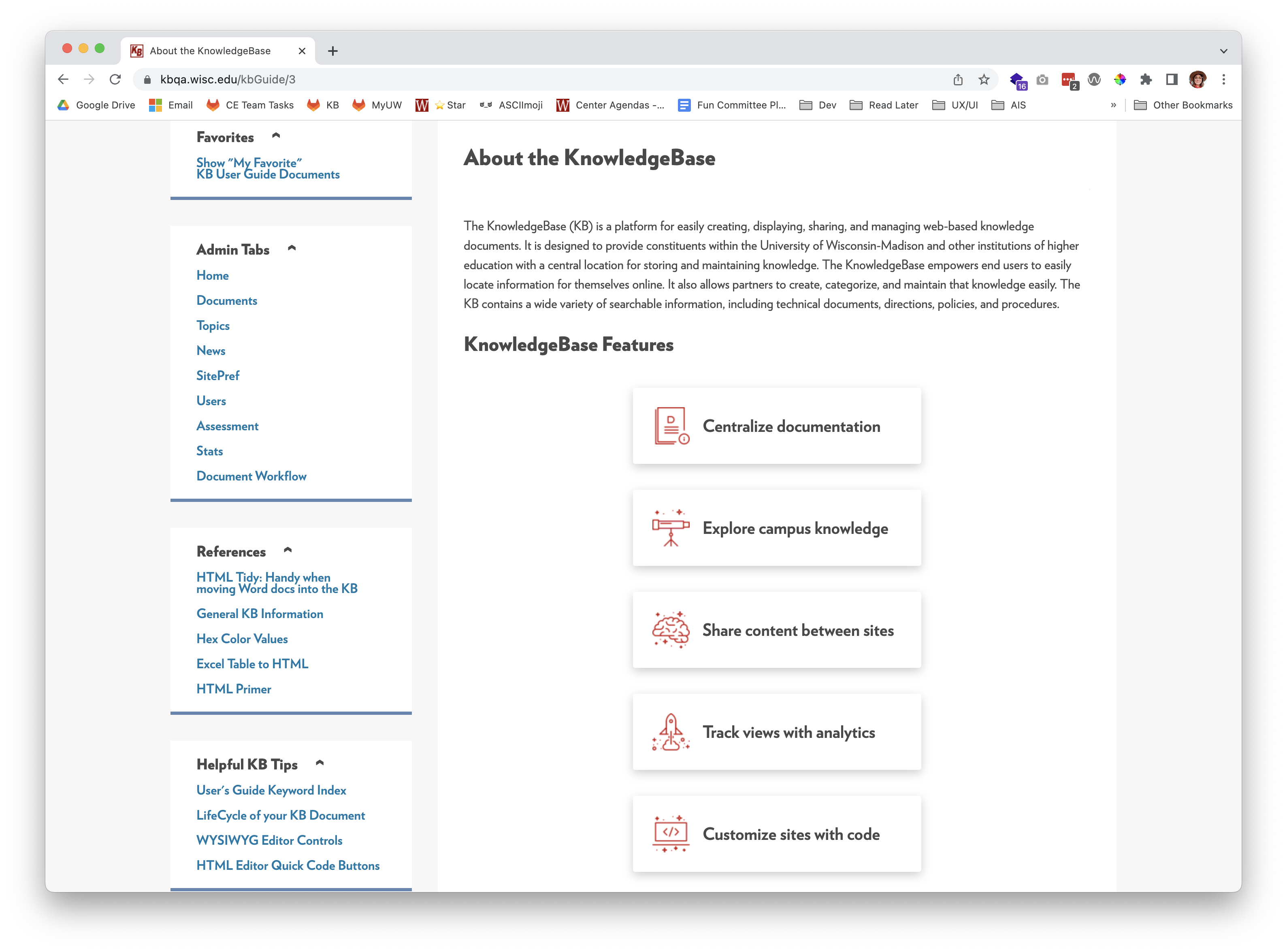
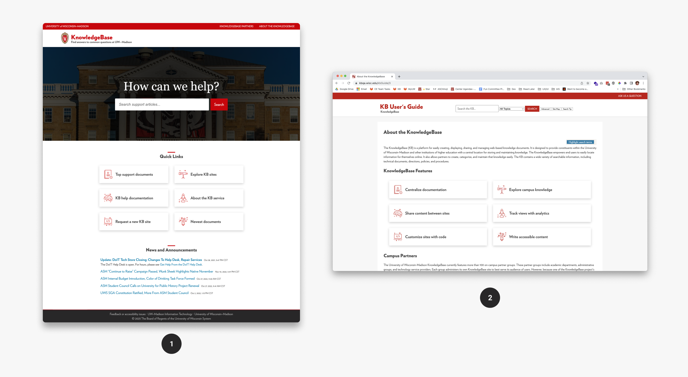
- The first image shows how this page element appears on a KB site using the Homepage Layout V2 template.
- The second image shows how this page element appears on a document when a site's standard layout settings are set to one column with no left and right side modules.
Add featured links to a document
Open the code view of the WYSIWYG editor.

Copy the code from the HTML tab below into the code editor:
See the Pen Featured links with icons by WPS Client Engagement (@clientengagement) on CodePen.
Scroll down to the bottom of the page and open the Show Additional Fields panel. Add an opening and closing style tag into the JavaScript/CSS field: <style> </style>

Copy the CSS from the CSS tab from the embedded Codepen above and paste it in between the two style tags.

Click Submit to save your changes.
Start with no icons
If you'd like to start with no icons, use the following HTML and CSS using the instructions above.
See the Pen Featured links - No icons by WPS Client Engagement (@clientengagement) on CodePen.
Add your own icons
Upload your icons into the document's attachment folder, and then change the URL path to your image in the CSS under the background-image property.
Add featured links to your homepage with a custom content module
First, create a new document and complete the steps in Add featured links to a document. Note your document ID to use in a later step. You can find the ID at the top of the page. It will read similar to “Editing Document 123456.”
Navigate to the Settings tab and click on Content Modules in the left hand sidebar.
Under the header Add a custom content module you will…
- include a module name, which will display as the header of your section.
- select whether to display on your internal or external site.
- select FullView and MobileView to display both on desktop and mobile devices.
- if you have more than one content module on the page, choose the order in which you want this section to appear on your homepage.
- add the ID of the document you just created.
- click Add, and then Update at the bottom of the screen.

Design guidelines
Now that you have a starter template for featured links, you can customize the content and styling.
Edit the content to reflect what’s most important to your users. Some helpful tips to get started...
- Leverage Google Analytics data to understand how users engaged with your documents.
- What documents do they visit most often? Are those documents helpful?
- Can the documents they visit most be grouped into similar categories?
- Within the KB dashboard under the Stats tab, click on Top searches in the left hand sidebar to see what people search for most on your site.
- Does your site have documents that supports what they want to find?
- Do you notice anything unusual?
- What questions do my users ask when they reach out? Where do they tend to get confused and ask for help?
Don't do this
This page element should not...
- exceed six links
- use an odd number of links
- display only one link item
- use a mixture of no icons and icons; commit to either one or the other for each section where this page element is used
- use more than one color for icons or colors that do not meet UW brand and accessibility guidelines
- use icons from different icons packs
More about icons
Color
We recommend only using UW's blue, red, or body font color for icon colors. Visit University Marketing's web colors guidance to learn more.
When not to use icons
Icons should only be used when they communicate meaning related to its associated content, not just for visual aesthetics. If it takes longer that 5 minutes to think of an appropriate icon, don't use them because it's likely a use case where icons won't provide effective meaning.
Icon libraries
DoIT Communications has created an icon pack usable by campus for their websites. You must log in to Box to access these files.
For more icons or non–UW sites, we recommend Material Icons which are open source and can be used without cost. Use the SVG file type with Material Icons for best image quality or if you want to change the icon color. If using the PNG file type, download an icon size that's at least 48px by 48px.

