KB User’s Guide - Settings Tab - Apply a custom homepage layout
About custom homepages
Design your new homepage
- Edit and customize your new homepage layout
- Add a custom content module that displays a list of featured links
- Add additional content modules
- Customize your homepage with CSS
Additional features
Overview
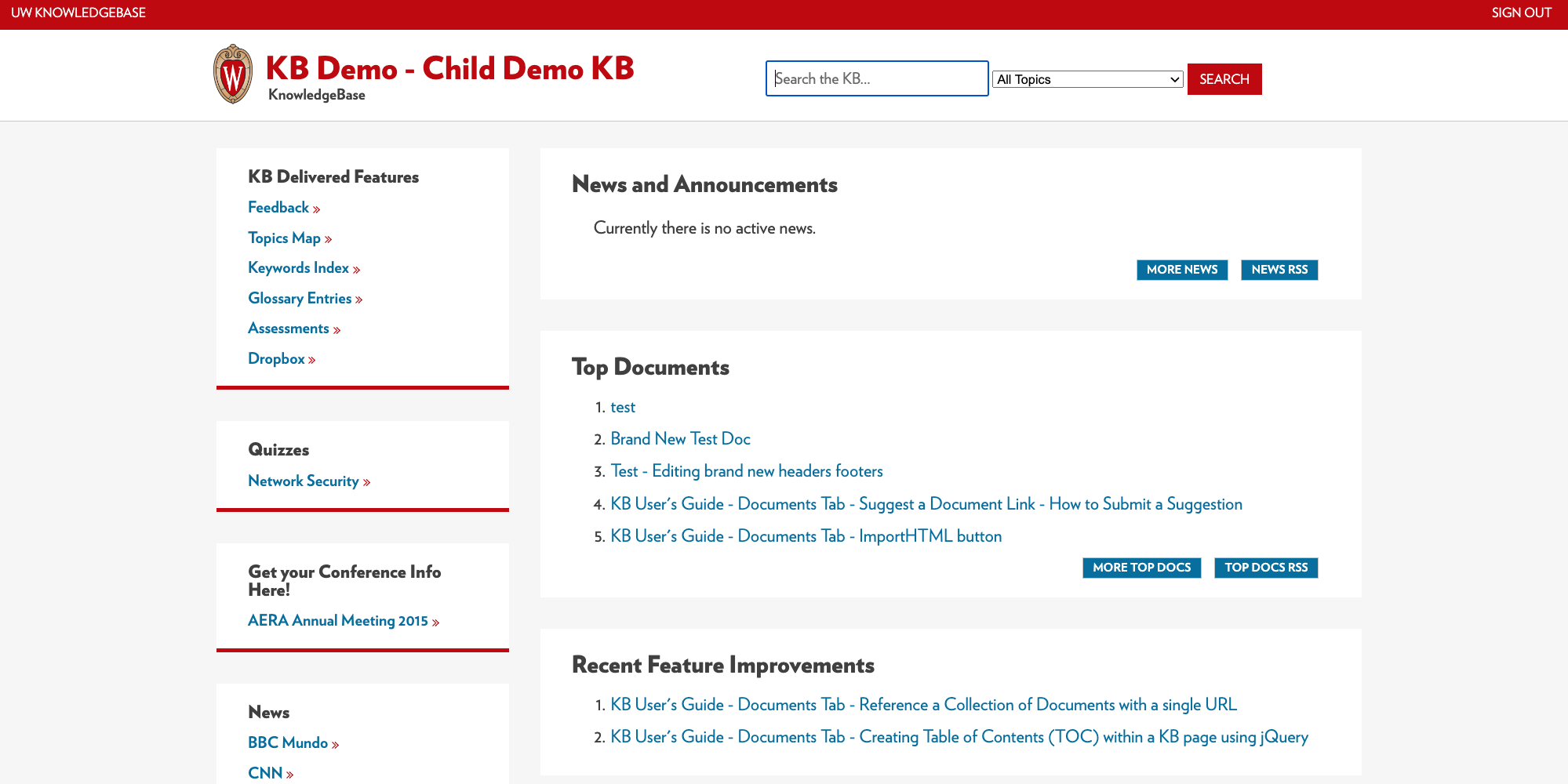
For most UW—Madison sites, we recommend using the default Standard / Subpage Layout settings for overall look, feel, and homepage design. Below is an example of a homepage using the recommended responsive settings, which can display up to 3 columns of content:
Learn more about the default layout options and how to use them.
A new template was released in February 2023 that allows people to use a custom layout for their homepage. This layout can be applied to both external and internal sites.
Custom homepage features
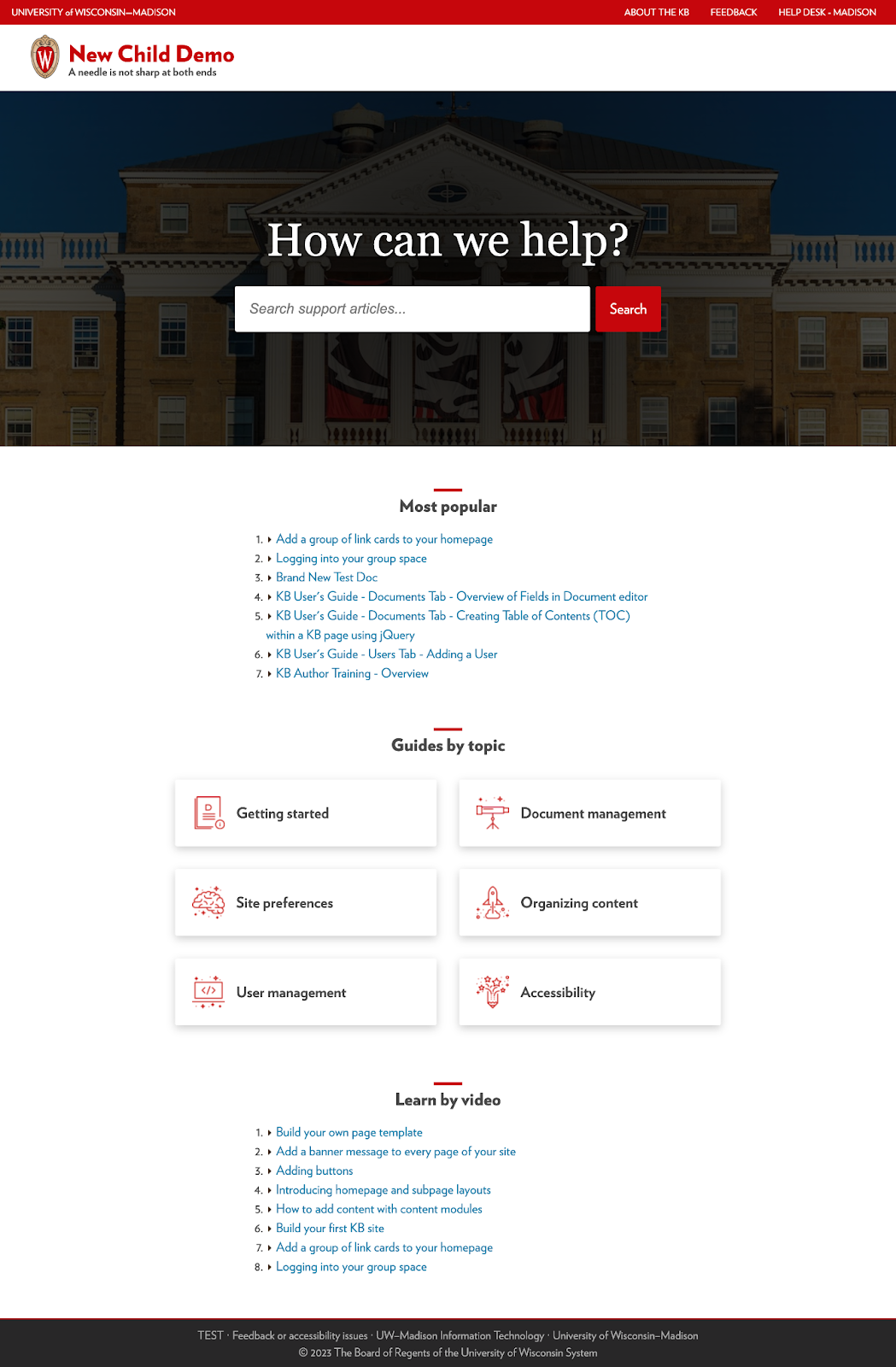
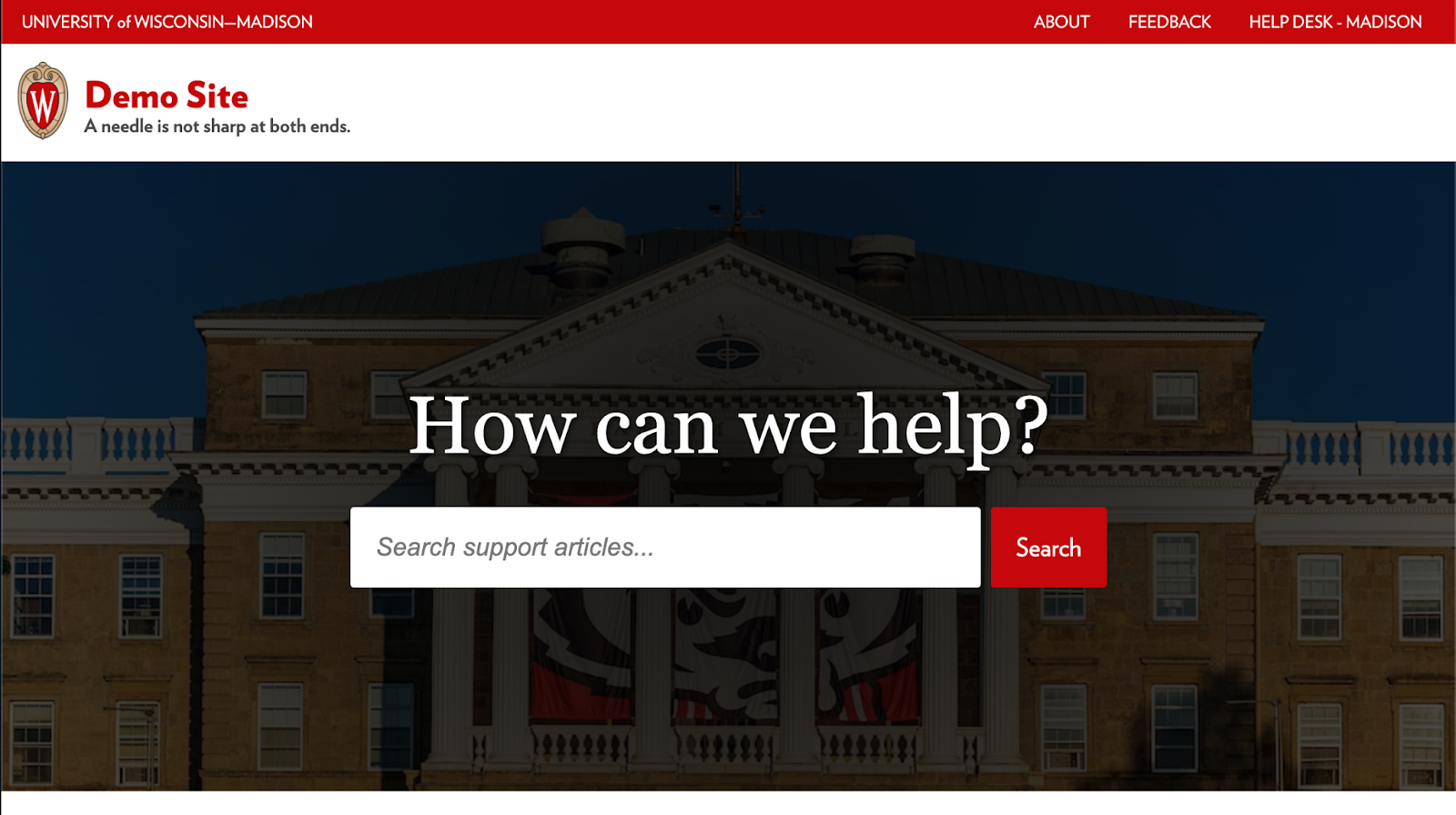
Below is an example of the homepage template, which includes a…
- utility menu (top red navigation bar at the top of the window)
- site logo, title, and tagline (the text below the site title)
- background image that rotates on page refresh if more than one image is included
- search bar that displays on top of the background image
- header that displays above the search bar and reads, “How can we help?”
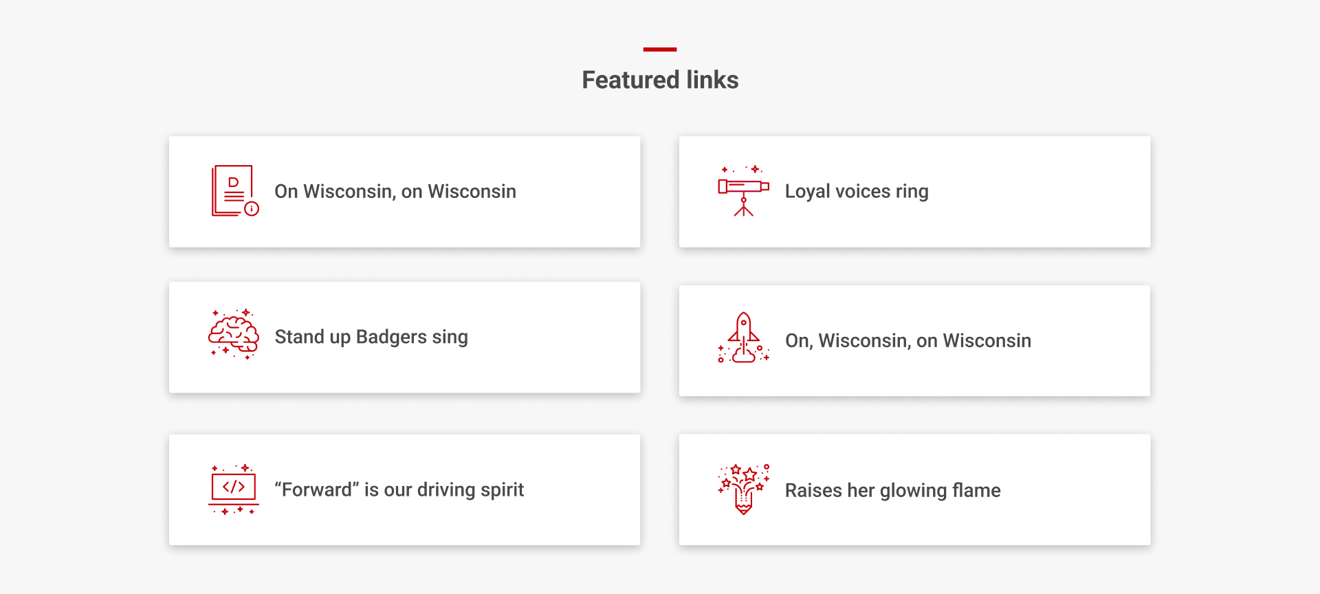
- custom module of links that display in a two-column card layout
Apply the custom homepage to your site
Apply the custom homepage layout by navigating to the Settings tab, and then Site Layouts in the left sidebar.
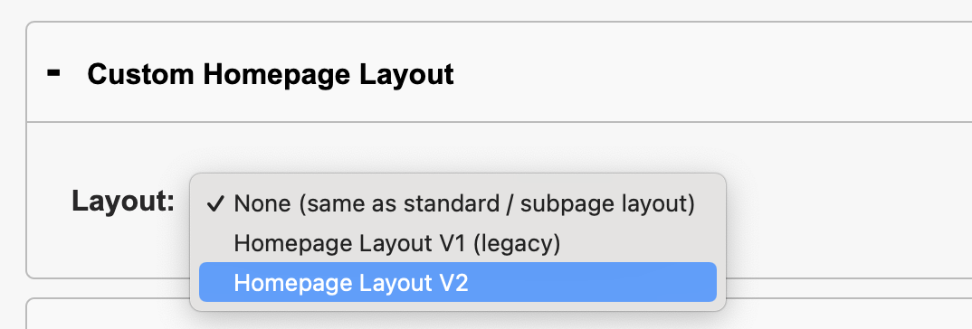
Open the Custom Homepage Layout panel for either your internal or external site and select Homepage Layout V2.
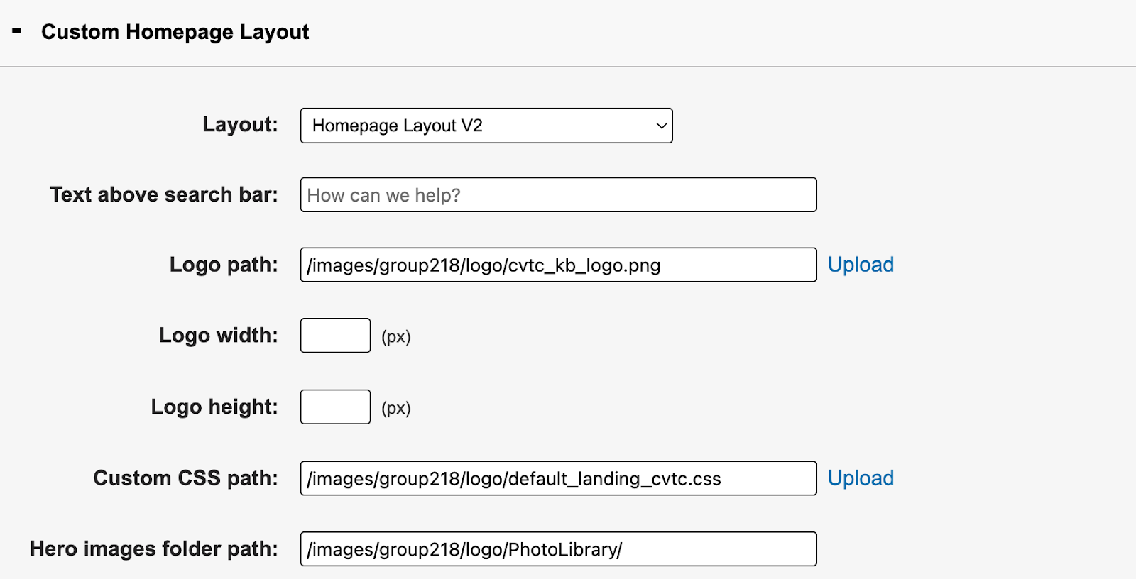
You will see the following options display:
Click Update at the bottom of the screen to apply the new layout. Next, we’ll walk through how to edit and customize your new homepage.
Edit and customize your new homepage layout
Top utility menu
Update top utility menu (the red bar) at the top of the page by navigating to Side Module Links in the Settings tab. Edit the Top Left and Top Right links respectively.
If you set these before switching to a custom homepage layout, these settings will carry over.

You have not created side modules before, read more about how to create and add them to your site.
Note: The Top Left Links and Top Right Links are the only side modules that will display on the homepage layout. All others will only display on subpages of your site, even if the side module is enabled for the Homepage like below:

Header text above search bar
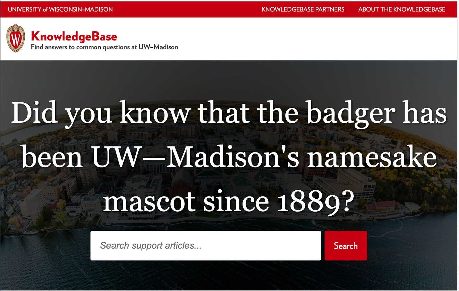
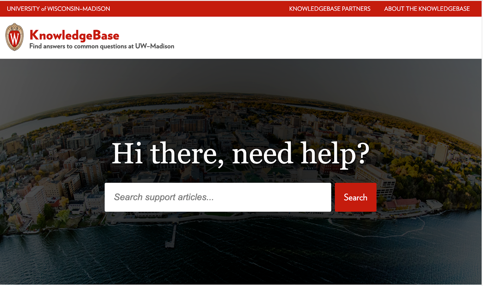
You can customize the text that displays above the search bar, but we recommend 27 characters or less. Shorter length titles are best for readability to help users quickly scan the page.
Don’t do this
Do this
Logo, site title, and tagline
To upload a logo…
- click the Upload link to open your Group Logo Folder.
- upload a new image or choose an existing one.
- copy the URL path of your desired image and paste into the site logo image path
- use the logo image width/height fields to change its size

Notes for UW—Madison users
- We advise using the existing UW crest logo in most cases to create a consistent visual experience across campus.
- The width/height fields can only be changed using CSS.
To add or update your site title and tagline…
- navigate to Group Spaces in the left hand sidebar under the Settings tab.
- click the edit button to open your group space settings.
- At the of the page, edit the site title and tagline fields for your internal or external site.

Rotating hero images
You can add multiple hero images that display behind the search bar and rotate on page refresh. You can use one image, but the rotation feature will only work with more than one. If no image is applied, a solid dark gray color will display instead.
To add hero images…
- navigate to the Group Logo Folder in the left sidebar of the Settings tab.
- enter a folder name and click the Create folder button.
- populate this new folder with your desired background images.
- copy the URL of the new folder path and paste into the hero images folder path field.
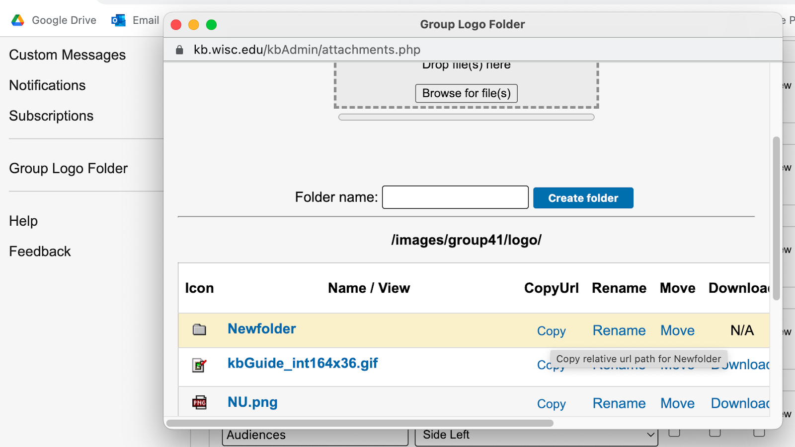
We recommend 1200px by 600px for the image size. Use the JPG file format for photos to reduce the file size, and the PNG file format for images with patterns or blocks of solid color to increase sharpness.
It’s best to use images that are high quality, because an image that’s pixelated or distorted can have a negative impact on the user’s experience. Visit the UW—Madison photo library for high resolution images.
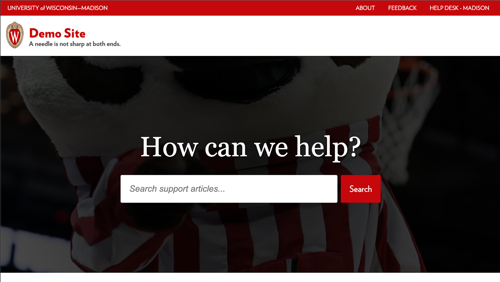
Don’t do this
Avoid using images that lose their meaning when resized, like a portrait of Bucky Badger where their face isn’t visible on wide screens.
Do this
Use images that are more minimalist or abstract to avoid distracting the user. For example, use landscapes and architecture instead of up close portraits of people or patterns that feel loud.
Add a featured links page element
This homepage layout allows you to add feature a group of links in a two column card-style layout by using a custom content module. Learn how to add this page element: KB User's Guide - Advanced HTML - Create a list of featured links
Add additional content modules
Learn how to add additional content modules to your page, but take care not to overwhelm your users with too much information — show only what’s relevant. Unless you create a custom module like above, content will display in a one column layout.
Design guidelines
Users should be able to quickly find the information they need. Before adding additional content modules, consider what information is most important to your users. Some helpful tips...
- Leverage Google Analytics data to understand how users engaged with your documents.
- What documents do they visit most often? Are those documents helpful?
- Can the documents they visit most be grouped into similar categories?
- Within the KB dashboard under the Stats tab, click on Top searches in the left hand sidebar to see what people search for most on your site.
- Does your site have documents that supports what they want to find?
- Do you notice anything unusual?
- What questions do my users ask when they reach out? Where do they tend to get confused and ask for help?
Don't do this
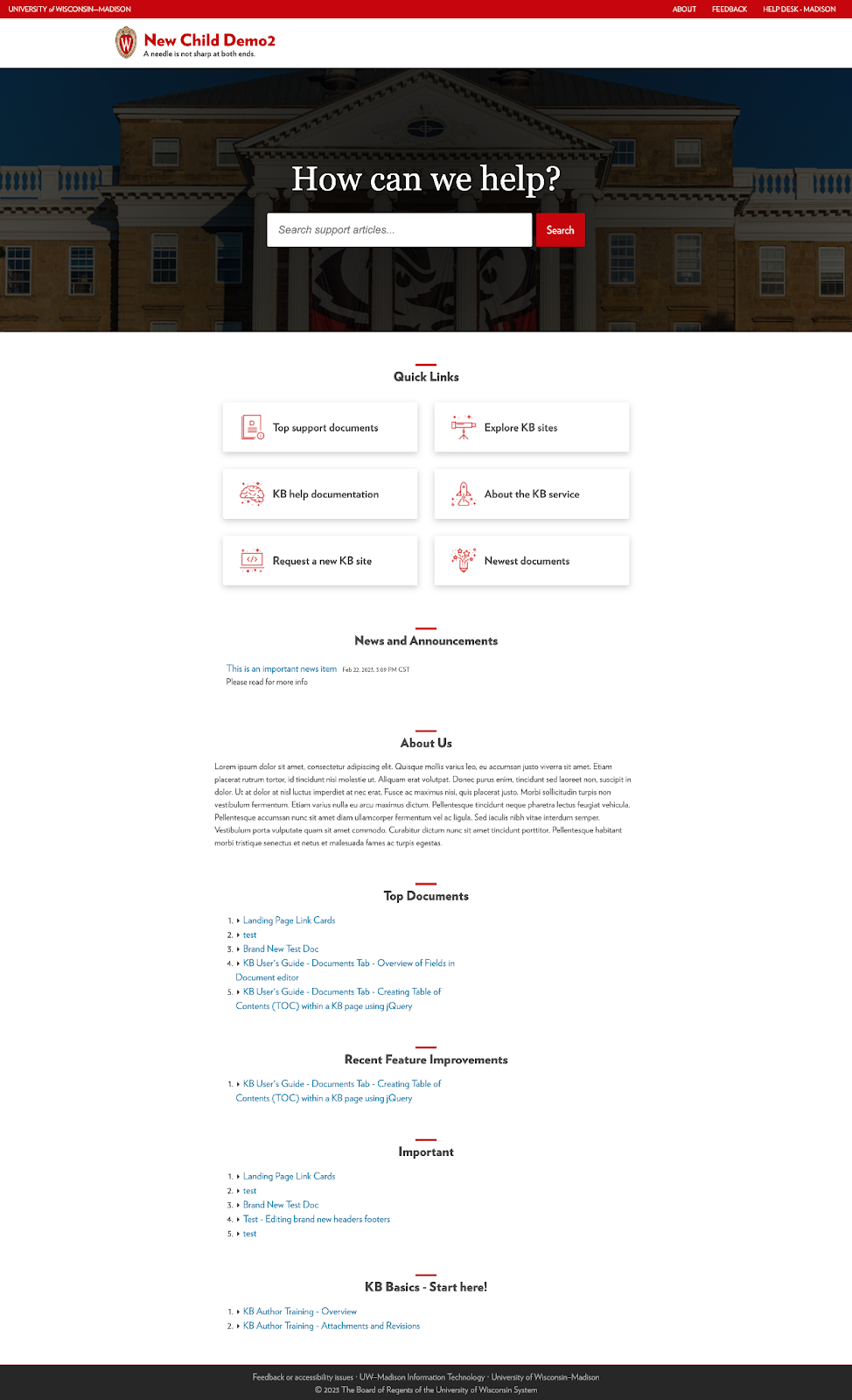
Don’t add more than two to four content modules. Remember that quality content is what matters most; it’s the heart of every good user experience.
Do this
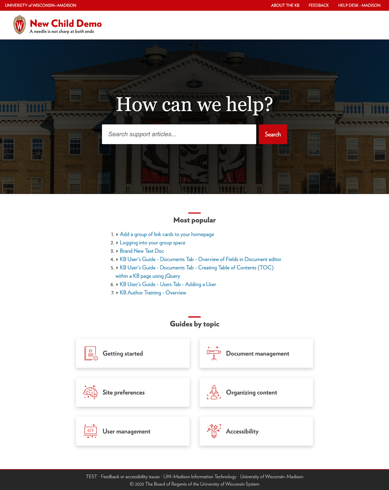
Start with the most critical information first, and group related content into logical categories that your users will understand.
Customize your homepage with CSS
Following the same steps as the logo image, upload, and/or copy and paste the URL of your .css file into the Custom CSS path field. Using your browser's inspector tool on your KB site is a quick way to reference these default rules.
Display a banner message for time-sensitive information
Follow KB User's Guide - Settings Tab - Banner Alerts for how to display a notification on your homepage. In this layout, the notification appears below the hero image and includes a light yellow background that meets WCAG Level AAA accessibility standards.
Design guidelines
A site alert is meant to display time-sensitive warnings or directions across every page so that users see it whenever they visit the site.
Don’t do this
Avoid lengthy blocks of content. Short and simple sentences allow more people to read and understand your message in the shortest time possible.
Do this
We strongly recommend a message that is no longer than 50 - 225 characters.

Think of bullet points as mini headlines that are simple, short, and related to a singular topic.


